General Layout of the Analysis Page
General Layout of the Analysis Page
The Analysis page is divided into several sections:
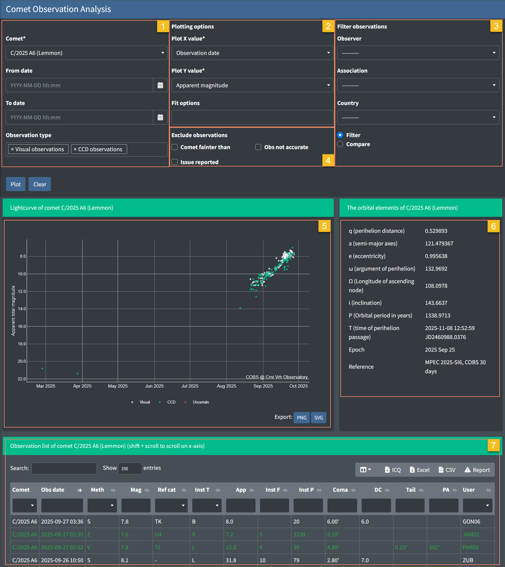
- Selection Panel (top left) – Choose the comet, date range, and observation type.
- Plotting Options (top middle) – Select what to plot on the X and Y axes, and add fit options.
- Filter / Compare Panel (top right) – Filter or highlight observations by observer, association, or country.
- Exclude Observation Panel (top middle) - Lets you remove certain categories of observations from the plot and the observation table
- Lightcurve Plot (middle left) – The main graph showing selected observations and fitted curves. Export options (PNG, SVG) are available below the chart.
- Orbital Elements (middle right) – Displays orbital parameters of the selected comet (perihelion distance, eccentricity, inclination, etc.).
- Observation List (bottom) – A detailed table of all included observations. Can be searched, sorted, or exported (ICQ, Excel, CSV, or Report).
Navigating and Exploring the Plot
The lightcurve graph is built with Plotly, which provides interactive zooming and navigation:
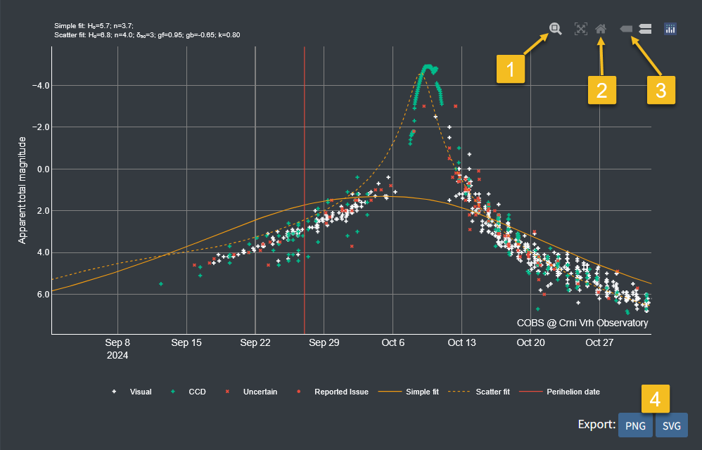
- Zoom
- Click and drag a rectangle on the chart to zoom into that region.
- Double-click the chart to reset to the full view.
- Reset axes
- Click the “home” button in the chart toolbar to return to the default full-range view.
- Show closes data / Compare data on hover
- Test
- Export image
- Use the page’s built-in PNG/SVG export buttons under the plot for higher-quality output.
Working with the Observation List (DataTables)
The observation list at the bottom of the page uses DataTables.js, which provides interactive filtering and searching tools:
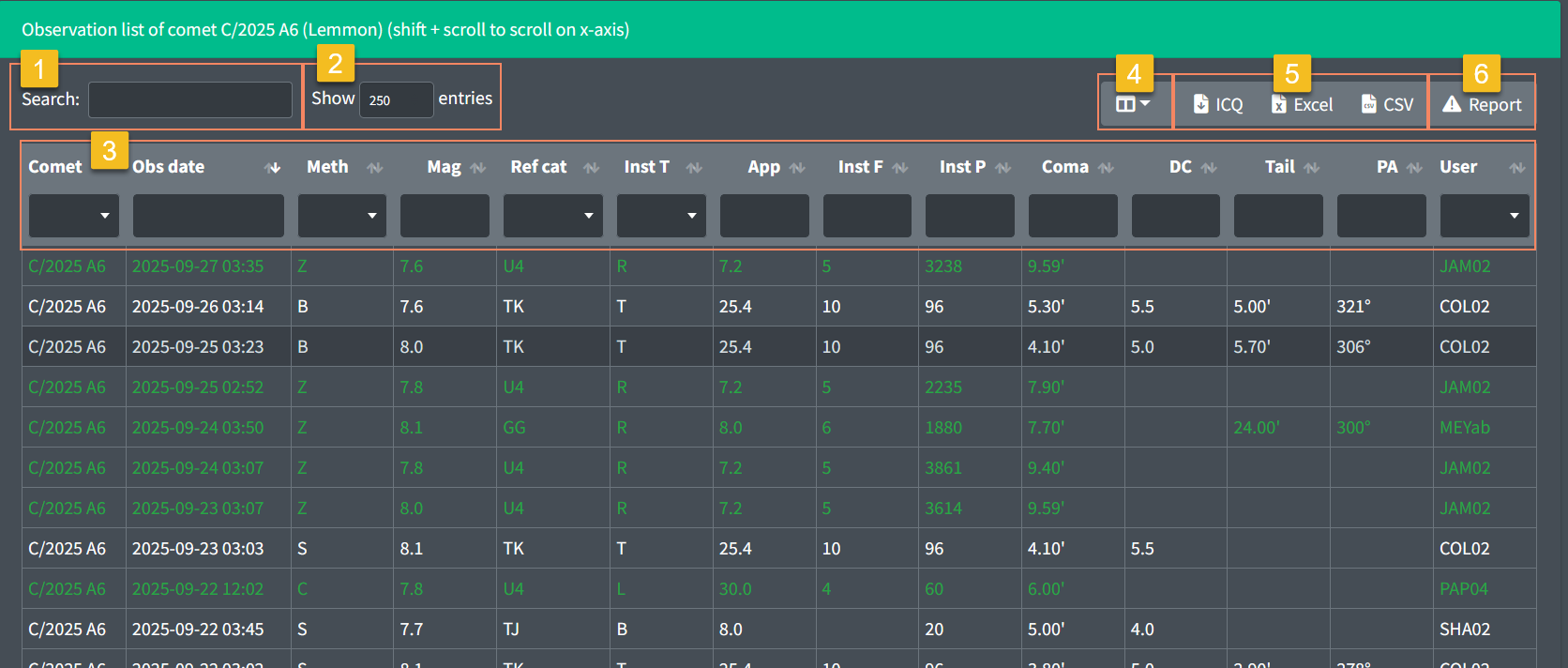
- Search box – type any text (e.g., date, observer code, magnitude) to quickly filter rows that match your query.
- Show entries – adjust the number of rows displayed at once (e.g., 100, 250, 500, 1000) for easier browsing.
- Column sorting – click a column header (e.g., Mag or Date) to sort the table in ascending or descending order.
Column filtering – use individual column filters to narrow down data based on specific criteria for each column. - Column visibility selection - choose which columns are displayed in the table to focus on relevant information.
- Export – download the data in multiple formats for offline use:
o ICQ (standard report format)
o Excel
o CSV - Report observations - a custom function allowing users to flag potentially false or erroneous observations for review
👉 Tip: Filtering applies live just to the table, so the lightcurve plot will still show the full dataset unless you also adjust filters in the top panel.